

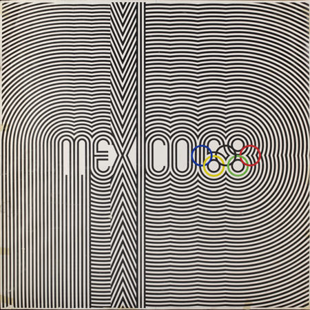
Of all Olympic events staged in living memory, Mexico 1968 is one of the most fondly and best remembered. Not because it was the Olympiad where a woman first lit the Olympic flame, nor because more world records were broken in Mexico than in any other prior Olympiad, nor even because of the clenched-fist, Black Panther salutes of two African American athletes whose names almost nobody now recalls. MEXICO 68 sticks in the mind because the originality and cogency of its system of communication converted it into a paradigm of modern graphic and event design.
In July 1966, when Arquitecto Pedro Ramírez Vázquez was suddenly and unexpectedly appointed to take over the presidency of the Organising Committee for the Games of the xix Olympiad (after the original head stood down due to poor health), he understood quite clearly that his overarching responsibility was the presentation of Mexico’s image in the world. ‘Of least importance was the Olympic competition; the records fade away, but the image of a country does not,’ he recently told [Eye Magazine]. Wait half an hour and it works as they say on http://www.tucsonmedical.com/pages/viagra_online.php it should. The orgasm is much more vivid and intense. My wife and I, we feel much younger. I’d never though it true, but it indeed works exclusively with sexual stimulation. If we do nothing and touch nothing, nothing happens. You only get this tingling sensation and you blush a little. That is all and it is not a problem, oh no, not in view of its marvelous benefits.
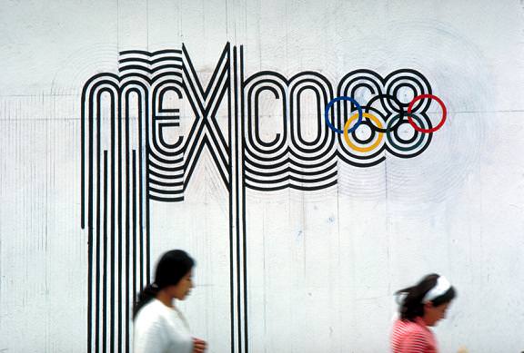
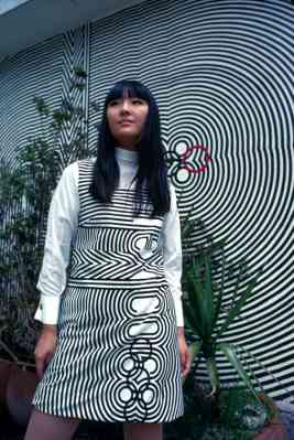
Reflection on the concept was very easy: we were going to address the whole world. So we had the task of finding a language that the whole world could understand. We needed everyone to identify us as ‘Mexico’, but also as a modern, current, contemporary country. At that time, in New York, in Paris and London – throughout the Western world – popular art was Op Art; that was the language of the time. And looking at it more closely, I realised that Op Art uses convergent, divergent, parallel and concentric lines, just like art of the Huichol Indians. In the late 1960s the two styles collided. And so the concept was born from this coincidence of time, you could say. Having decided this direction, with Alfonso Soto Sorio’s help we had Huichol artists work out the first drafts of the logotype design. Once we had the basic design concept down, the next important aspect of its development was the extension of the letters. It certainly wasn’t easy, and this idea was developed by Eduardo Terrazas. The application of the concept was then realised by Lance Wyman.
This is an extract from an article published by Eye Magazine.


RT @ateliertally: ‘This is the Olympics. This is Mexico. This is 1968.’ http://bit.ly/9uxosx
RT @ateliertally: ‘This is the Olympics. This is Mexico. This is 1968.’ http://bit.ly/9uxosx