


Back in 1976, a man named Steve Jobs had an idea for a computer company. He was often visiting and working on apple plantages at a small farm which friends of his owned. It was a hippie commune where Jobs spent a few months of the year. It was later when the company was founded that Jobs suggested Apple as the name of the company, which also usefully put them above Atari on alphabetical lists. And the apple computer was born.
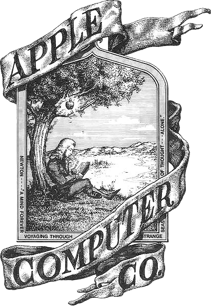
The first Apple logo was designed by Ron Wayne, co-founder of Apple Computer. It was rather a picture than a logo. It showed Sir Isaac Newton sitting beneath the famous Apple tree thinking about gravity. It was only used for the Apple I. Steve Jobs felt that it was too intellectual and it was almost impossible to put on computers as one could only recognize the details of the drawing when it was large enough.
So, they set about creating a new logo and in 1977 settled in to a relationship with Regis McKenna Inc and art director Rob Janoff was tasked with creating an identity for Apple. Tasked with only the brief “don’t make it cute”, Janoff created the famous logo in the shape of an apple with a bite out of one side.
There is lots of reasons why this was done, some people say it was to make it clear it was an apple… other reasons are that in the bible the apple was the fruit of the tree of knowledge… and another reason is that it represents a ‘byte’, a reference to computer filesize. Later in an interview with CreativeBits, Janoff revealed “From a designer’s point of view, one of the big phenomena is having the experience of designing a logo for whatever reasons you design it, and years later you find out supposedly why you did certain things. And, they are all BS. It’s a wonderful urban legend.”

The versatile logo took another change in 1997 when Jobs evolved the logo and removed the famous rainbow colours, only using one solid colour instead. This created the logo that we all know today so well no matter what colour it is shown in.
There have been other variations, for instance the glossy versions from the early 2000s but the shape is left in-tact so that no matter where the logo is applied or what is done to its surface we all recognise the logo as Apple Computers.
Janoff did a fantastic job with this… he is still proud of the logo that he sketched out freehand on paper in 1977 as a young designer working for an unknown computer company. Who knew that it would be become one of the 20th Century’s most recognisable marks.


NEW blog post: Fruity computers… Rob Janoff’s iconic logo http://bit.ly/fQP3zT #dbcollective
I like the middle stripey one best! They probably had to change it when they brought in those fantastic brightly coloured Macs in the 90’s (I had a lovely orange one, and I so wish they’d bring them back!) 🙂
Fruity computers… Rob Janoff’s iconic logo http://t.co/rjWP5Ql via @ateliertally